closing tag is in template navbar
timefactors watches


TZ-UK Fundraiser

View Poll Results: Do you like the new Rolex Air-King, YES or NO?

Voters
202. You may not vote on this poll
  • Yes, I like the new Rolex Air-King

    68 33.66%
  • No, I do not like the new Rolex Air-King

    134 66.34%
Page 2 of 2 FirstFirst 12
Results 51 to 92 of 92

Thread: Poll: New Air-King, yes or no

  1. #51
    Master
    Join Date
    Aug 2012
    Location
    Glasgow
    Posts
    2,289
    Looks too much like the Omega AT for my liking.

  2. #52
    Master
    Join Date
    Dec 2003
    Location
    Berkshire
    Posts
    1,355
    Quote Originally Posted by TimeOut View Post
    Very odd looking thing. I'd have to see it in the flesh.

    Probably be worth a mint in 40 years.
    .. when it lasts 5 minutes and sells bugg*er all

  3. #53
    Apprentice poc4e's Avatar
    Join Date
    Sep 2015
    Location
    Brasil/USA
    Posts
    21

    NO

    What an abomination. Much prefer the older version.

  4. #54
    Grand Master Der Amf's Avatar
    Join Date
    Oct 2015
    Location
    UK
    Posts
    12,023
    Some recent releases from all kinds of companies from PP down have made me wonder if there's a recently-identified need in the market for expensive watches that look che....that have ...democratic styling.

  5. #55
    Master
    Join Date
    May 2011
    Location
    By the TOLL Road
    Posts
    5,074
    Blog Entries
    1
    I like it, in fact I like it a lot. The old one that the OP posted, if the Air King font was missing, I would swear it was an Explorer1.

  6. #56
    Grand Master MartynJC (UK)'s Avatar
    Join Date
    Dec 2008
    Location
    Somewhere else
    Posts
    12,412
    Blog Entries
    22
    Should get back to basics.


    New one has too many numerical?

  7. #57
    Master Alansmithee's Avatar
    Join Date
    Jul 2013
    Location
    Burscough, UK
    Posts
    9,595
    Like the design but cannot get past the dial...

  8. #58
    Craftsman
    Join Date
    Dec 2013
    Location
    Kent
    Posts
    754
    It looks like it belongs on a market stall table in Lanzerote.

  9. #59
    Craftsman eletos's Avatar
    Join Date
    Oct 2015
    Location
    Nottingham
    Posts
    704
    Not for me thanks. Too cluttered.

  10. #60
    Master Rocket Man's Avatar
    Join Date
    Jun 2013
    Location
    United Kingdom
    Posts
    2,798
    Apparently the typography used for 'Air King' at 6 o clock was decided by Hans Wilsdorf in 1943.

    It's the only thing I like about this new edition.

  11. #61
    Master Shakespeare's Avatar
    Join Date
    Mar 2011
    Location
    Warwickshire
    Posts
    1,396
    I think it lacks cohesive design. The mix of hour and minute numerals is messy and confusing. The logo looks dumbed down. Almost Google-like in its yellow and green.

    Original every time for me

  12. #62
    Master
    Join Date
    Dec 2013
    Location
    Chester and Merseyside, UK
    Posts
    4,341
    Who let the Lego parts department put together that dial and hands?

    A "no" from this Rolex fanboy.

    Haywood

  13. #63
    Craftsman
    Join Date
    Dec 2015
    Location
    London, UK
    Posts
    965
    Won't be popular. Won't sell in huge numbers despite discounts and incentives from dealers. Rolex will discontinue production after a few years.
    Will be worth an absolute fortune 30 years from now.

  14. #64
    Master
    Join Date
    Nov 2015
    Location
    Worthing, England
    Posts
    1,746
    Lose the numbers and it would be a lot less offensive in my eyes.

  15. #65
    Grand Master markrlondon's Avatar
    Join Date
    Feb 2009
    Location
    London, England
    Posts
    25,369
    Blog Entries
    26
    Quote Originally Posted by groyn View Post
    Rolex will discontinue production after a few years.
    Will be worth an absolute fortune 30 years from now.
    <chortle>

  16. #66
    Master
    Join Date
    Feb 2015
    Location
    Surrey
    Posts
    1,182
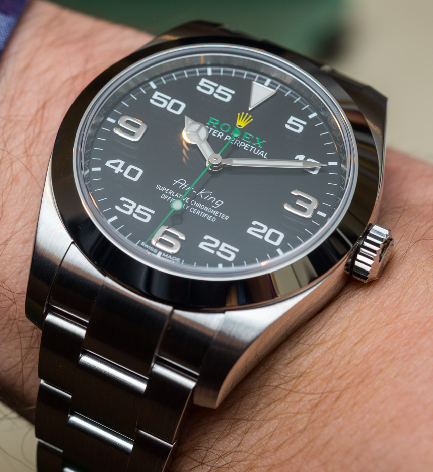
    First wrist shot I've found of the Air-King. Gotta say I'm liking it more and more. I think part of the attraction is that it's clearly going to be unpopular and I like being bloody minded! I know with the minute markers they're trying to take it back to its pilot roots, but I think the numerals combined with the brand colours make it look very motorsport.


  17. #67
    Master
    Join Date
    Dec 2003
    Location
    Berkshire
    Posts
    1,355
    Hamilton did it better/properly - no half measures, 44mm, the proper hands, and no silly green bits for the Asian market.

    Let''s face it Rolex are flogging an upgrade to a Titoni here .... it's not meant for the UK market.


  18. #68
    Quote Originally Posted by kk View Post
    Hamilton did it better/properly - no half measures, 44mm, the proper hands, and no silly green bits for the Asian market.

    Let''s face it Rolex are flogging an upgrade to a Titoni here .... it's not meant for the UK market.

    Lol😄
    Too much to drink, may be.

  19. #69
    Master
    Join Date
    Dec 2003
    Location
    Berkshire
    Posts
    1,355
    Quote Originally Posted by RAJEN View Post
    Lol
    Too much to drink, may be.
    Are you seriously arguing that that horrific mishmash of a Rolex dial is better thought out than the one in the humble Hammy? Why? Just because it's a Rolex, innit?

  20. #70
    Grand Master Der Amf's Avatar
    Join Date
    Oct 2015
    Location
    UK
    Posts
    12,023
    Quote Originally Posted by kk View Post
    Are you seriously arguing that that horrific mishmash of a Rolex dial is better thought out than the one in the humble Hammy? Why? Just because it's a Rolex, innit?
    I agree that the Hamilton dial has the advantage of a coherent design.

    One thing not helping the cluttered Rolex dial is the thick bezel adding to the noisiness.

  21. #71
    Craftsman
    Join Date
    Aug 2015
    Location
    ...
    Posts
    321
    Quote Originally Posted by Grandsire View Post
    It looks like it belongs on a market stall table in Lanzerote.
    I somewhat agree with alot of the already mentioned comments. But honestly, they are Rolex, they can do anything and as long that it has that brand it will most likely sell. Rolex knows exactly what they are doing here, there is no doubt that this is intended as an 'entry' Rolex and therefore they made it "sporty" so that it appeals to younger people.

  22. #72
    Quote Originally Posted by Der Amf View Post
    I agree that the Hamilton dial has the advantage of a coherent design.

    One thing not helping the cluttered Rolex dial is the thick bezel adding to the noisiness.
    It's a parts-bin watch if I've ever seen one. No wonder it's incoherent.

    I suspect that the main reason for its existence is to help move out components such as Milgauss cases/bezels (or Datejust II; I'll check which one it is with a caliper once they arrive in Norway), and pre-2016 Explorer solid numerals and dial blanks. Using the older cal. 3131 instead of the Paraflex-equipped 3132 is an especially-obvious sign of getting rid of old stock.

    Also, the diver's handset makes zero sense with the alleged instrumentation theme, and I see no reason for the dial on what was originally a pilot's watch to resemble a car's speedometer in the first place. The DJ II was no prize, either, but I don't think I've ever seen a clumsier steel watch than this one from Rolex. It's unfortunate that they had to attach the Air-King's good name to it.

    On the plus side, the much-improved Explorer is available for about the same price.

  23. #73
    Master Tetlee's Avatar
    Join Date
    Jun 2014
    Location
    Somerset
    Posts
    3,002
    Quote Originally Posted by sean View Post
    A dog's dinner. It looks like they've thrown everything and the kitchen sink at it:

    1. Mercedes hands
    2. 5, 10, 20, 25 etc. interweaved with 3, 6, & 9
    3. Green accents
    4. Yellow crown
    5. Increased the size


    Maybe one or two of those 'enhancements' would have worked (apart from the mix of numerals) on their own, but taken altogether it's much less than the sum of its parts..
    Agree with the above, not for me at all. Just looks a train wreck.

  24. #74
    Craftsman
    Join Date
    Mar 2015
    Location
    London, UK
    Posts
    398
    I like it. Think it's a modern interpretation of a classic.

  25. #75
    Master
    Join Date
    Mar 2016
    Location
    North East, England
    Posts
    1,499
    Win! I think thold one was too small.

  26. #76
    Master Toshk's Avatar
    Join Date
    Aug 2015
    Location
    London
    Posts
    2,253
    Quote Originally Posted by Belligero View Post
    It's a parts-bin watch if I've ever seen one. No wonder it's incoherent.

    I suspect that the main reason for its existence is to help move out components such as Milgauss cases/bezels (or Datejust II; I'll check which one it is with a caliper once they arrive in Norway), and pre-2016 Explorer solid numerals and dial blanks. Using the older cal. 3131 instead of the Paraflex-equipped 3132 is an especially-obvious sign of getting rid of old stock.

    Also, the diver's handset makes zero sense with the alleged instrumentation theme, and I see no reason for the dial on what was originally a pilot's watch to resemble a car's speedometer in the first place. The DJ II was no prize, either, but I don't think I've ever seen a clumsier steel watch than this one from Rolex. It's unfortunate that they had to attach the Air-King's good name to it.

    On the plus side, the much-improved Explorer is available for about the same price.
    Totally agree!

  27. #77
    Receives a no from me. Too large for my taste;too many fonts and too many numbers.

  28. #78
    Grand Master
    Join Date
    Jul 2007
    Location
    Wakefield, West Yorkshire
    Posts
    22,535
    Don't like the dial or the size. 36 or 38mm would've been better IMO.

    Paul

  29. #79
    ^
    It's definitely a Milgauss case; they mention a "magnetic shield" for the movement in the specifications.

  30. #80
    It's the 5-55 markers I just can't stand. So un-Rolex. Really unimpressed

  31. #81
    Master
    Join Date
    Jan 2009
    Location
    Lincolnshire
    Posts
    5,956
    I posted I liked this about 24 hours ago, and 24 hours on I'm less enamoured.

    It does look like a redialled Explorer to me, albeit in a slightly different case, and now I am starting to wonder what the additional numbers add. Maybe would have been better without them.

    I like the old Air King, but way too small for my wrist, so that would always be a no from me.

    I'll see how I feel when I see one for real I think.

  32. #82
    ^
    On the other hand, given that it's essentially a Milgauss with brushed centre links and lug tops, it could be appealing when they put a less minging dial on it. Or just swap the dial, handset and crystal to create a de-blinged GV. :D

  33. #83
    Prefer the old version. The numbers and green highlights just don't do it for me.

  34. #84
    It's surely a st Patrick's day joke?
    "Bite my shiny metal ass."
    - Bender Bending Rodríguez

  35. #85
    Craftsman BernardF's Avatar
    Join Date
    Aug 2003
    Location
    Still in Germany..
    Posts
    556
    If you chuck the green text, replace the minute indices with batons and make it 36mm, I like it!

  36. #86
    Craftsman
    Join Date
    Oct 2013
    Location
    Leamington
    Posts
    299
    Big fan.

    Any thoughts on UK pricing?

  37. #87
    Master
    Join Date
    Dec 2003
    Location
    Berkshire
    Posts
    1,355
    Quote Originally Posted by delays View Post
    Big fan.

    Any thoughts on UK pricing?
    Seriously? You would spend your own pound notes on this abomination?

  38. #88
    Has promise of the numerical markers are booted.

  39. #89
    Master
    Join Date
    Dec 2013
    Location
    Chester and Merseyside, UK
    Posts
    4,341
    Quote Originally Posted by delays View Post
    Any thoughts on UK pricing?
    If only there was, like, a website or something....


  40. #90
    Craftsman
    Join Date
    Oct 2013
    Location
    Leamington
    Posts
    299
    Quote Originally Posted by Haywood_Milton View Post
    If only there was, like, a website or something....

    D'oh! I hadn't even thought to check, I didn't think they'd be so sporty with official pricing. Being "that guy" on the forum tonight...!
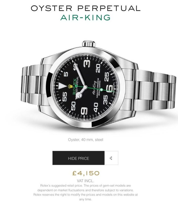
    Quote Originally Posted by kk View Post
    Seriously? You would spend your own pound notes on this abomination?
    £4,150. Crikey.

    When 14060 Subs can be had for less, sometimes much less, even a heathen who likes this watch fails to see the value.

  41. #91
    I kind of like it. I think. It's the perfect size and it's a bit out there, which is nice for Rolex to try out for a change (as opposed to leaving it just to Tudor). I can see this as a fun weekend watch, or something like that.

    Last edited by o u t a t i m e; 17th March 2016 at 22:45.

  42. #92
    Master
    Join Date
    Aug 2012
    Location
    UK
    Posts
    5,448
    Is it just me or does it look like they put one of those dealer wall clocks on a bracelet? I did a double take seeing the price, I had assumed it fitted into the range well below the Oyster Perpetual 39 or even standard OP, which looks so much more classy. Are they charging by the millimeter?

Posting Permissions

  • You may not post new threads
  • You may not post replies
  • You may not post attachments
  • You may not edit your posts
  •  

Do Not Sell My Personal Information