
 Reply With Quote
That look so cheap and nasty


Looks like my old Sub after I've been painting & decorating ...
Image Jocke

That look so cheap and nasty
Looks like a modded Seiko.
I think the crown is way too big.
Further, I 'm not a fan of the color scheme.
As a final remark: this probably is another 43+ mm watch and hence just too big for my wrist.
Originally Posted by Bernard

The size wouldn't put me off , but the crown and the colour scheme do .

Looks awful!
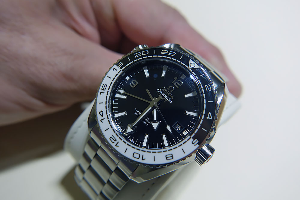
The bezel is horrible and the 8 on number 18 looks dreadful how it's connected on the white portion of the insert.

I was on the fence about this, but you have ruined it for me, that 18 looks more like a 13 and a horrible one at that.
I don't like the bezel or HE valve and I hate the size. I like that big crown though.
Now I think about the 6 is wrong too, it should be half black and half white, and if that couldn't be done then they used the wrong material after all (one of the big developments Omega put into this watch according to Worn&Wound and ABlogToWatch etc).
Last edited by trainspanner; 23rd March 2016 at 12:05.
There's a lot to be said for the simple aluminium insert...........Rolex should take note too.

Yikes, colour scheme is just awful, especially the 18 and 6.
Or a well executed one, like the LiquidMetal ones, personal favorite is on the blue Ti
Just to add:
Looks like Omega have lost their way with this one.
It's one thing to introduce longer service and warranty periods or start producing ceramic bezels and up scaling your prices to 'copy' Rolex.
But to copy a GS GMT and make it look even more of an Argos special takes some real skill
Surprised at the unanimous dislike for this watch - i didn't think it was THAT bad. But then, I am wearing this today:

Re: Surprised at the unanimous dislike for this watch - i didn't think it was THAT bad. But then, I am wearing this today:
It is the herd mentality.
Someone criticizes a brand/model and others cant wait to rush in to offer their own criticisms and insults. Happens here everyday.
The watch is not my cup of tea but is not crap either.
Not enough independent minds here. Quite a few trying to fit in.
True - I'm not overly impressed by that one photo, but I'll withhold a final decision until I've seen one in the metal.
Sometimes a picture paints a thousand words, but they're all the wrong ones!
M.
I actually really like the dial on this. The white/silver "Seamaster" text looks really nice, the lack of colour in general is a nice change, no orange second hand tip or text. I just can't get over these new bezels, especially those dashes around the inside. Those, along with the lines separating the numbers, just make it look far to busy to my eyes. A ceramic matte bezel like the PO8500's would look better, I think. Shame about the size, too.
https://www.omegawatches.com/fileadm...ance_large.jpg
A better picture above.
6 and 18 are not perfect but not a bad looking watch overall.
It does look better in those photos. Font on the bezel is a bit crap, but overall it is ok
Must say the watch does look good in that photo. Not as bad as I previously thought.
But I still stand by the numbers, they just look odd to me.
If this watch was described to me it would sound great. Two-tone, good contrast, not fussy; all things I would like.
From the pictures, however, the execution hasn't quite nailed it. Still, a good attempt.
I don't mind it in principle, if they could reduce the bulk and offer a midsize version. Better than some of those orange efforts they released at Basel.
Last edited by Itsguy; 23rd March 2016 at 15:22.
I think that's really very nice indeed.
The only thing that kills or for me is the He valve. Not one person will EVER take this watch saturation diving, so absolutely pointless. Better to have had it with 200m WR, and no He valve and made the perfect holiday watch.
I don't mind the white highlights as much as I thought I would; to me, white on a watch anywhere other than the dial is a bit TOWIE. But, it's an Omega, and that means it's too shiny and very, very large. So pass.
...but what do I know; I don't even like watches!
Who actually thought this looked good?!

I do.
My first thought when I saw the pic was that I really like it! That was before I realised the white thing is not a reflection. Now Im not sure its for me
Personally I love this! Looks way better with the black strap however.
I'm looking forward to seeing this and the other new PO colours in the flesh, I have a strong preference for three handers though.
I think if you look at most watches in enough detail you'll find things you don't like as much as the rest of it.
It's all about the thickness... They need to bring it down to under 15mm and the rest will follow...
It maybe isn’t just quite as dire as imagined – https://monochrome-watches.com/omega...ve-pics-price/
Last edited by PJ S; 24th March 2016 at 14:26.
I quite like this and the other po's that are coming out
That reminds me of an episode of Top Gear :)
...but what do I know; I don't even like watches!
Perhaps a new monkier of the "polarizer" :-)
I like it, but only because it reminds me of this:

neither my cup of tea!
I think the glossy finish on the bezel sort of spoils it! But overall not a favourite of mine regardless of that.
That or people just don't like it? For myself it is all the silver in the dial and hands. Just doesn't work for me on this watch.
Well I like it, but is it as nice as a Rolex BLNR? NO.
I've got the sword hands model from 2007 and that has the same black/silver bezel, but the 6 is correctly coloured. The date is nicely positioned unlike the ladies PO mentioned in another post. This certainly looks nicer than the GMT model that's been available the last couple of years, that bezel was even worse.
I agree with DBYeti that the He valve detracts from the design, the 300m sword hand model didn't have it (big reason I bought it) and I don't see the appeal.
The leather/rubber strap is interesting, by coincidence I currently have mine on a Hirsch Andy strap which is the same idea. Great minds think alike.
Dread to think what the price will be, that will kill it for me. I know times change but in 2007 mine was £1425 new and this will not be 3-4 times the watch mine is.

I saw this in Baselworld. Just as bad in the flesh as are the rest of the new Seamasters and that's from someone who had a PO.
I love it too.
Some reservations about the execution of the 18 on the bezel but I love the dial, hands and monochrome colour scheme.
Sadly though, Omega persist with that external HE valve, so ultimately for me, it's a no.
Big no from my side I'm afraid
Quite garish - i do wonder about Omega.
Not keen on this atall, looks like a cheap fake to me. Not good.
Another in the 'Yikes' camp. Some watches look better in the flesh but that could be even worse.
 Posting Permissions
