Reply With Quote
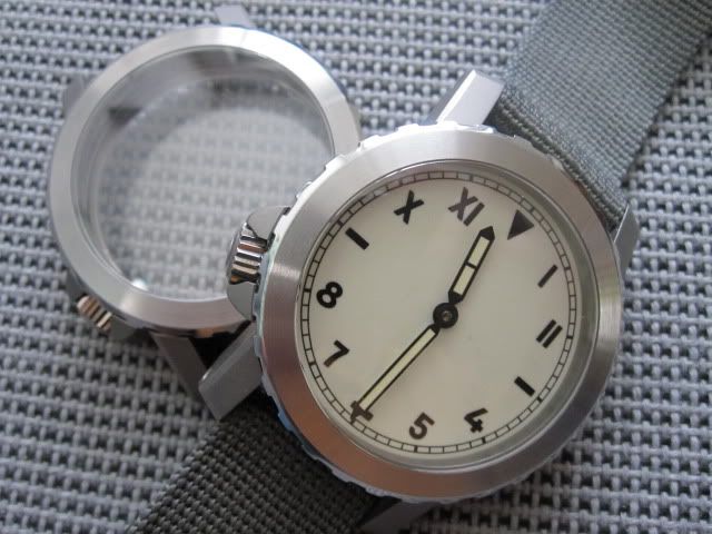
I dont like a great deal of text but i do insist on a sterile dial on a flieger


I have bought a Speedbird 3, three times now. It's a watch that I absolutely love yet somehow I kept flipping it. My latest purchase has been the GMT version and I think the reason for previous flipping has been that I just don't get on with a sterile dial. I like having text on the dial and the identity that gives a watch. It not a 'look at me' thing - I'm as happy having a little known make on the dial as I am having branded products. I do know that a lot of people prefer a more sparse dial.
So, do you prefer sterile dials? Why?

I dont like a great deal of text but i do insist on a sterile dial on a flieger
i do . why have irrelevant text on the dial ? unless youre into the brand per se. its analogous to paying for a branded t shirt. i dont want to walk around with 'nike' on my chest.
Good luck everybody. Have a good one.

true..but you may want to walk around with a subtle BOSS or GANT or a Tommy Hilfiger logo on your chest?Originally Posted by seikopath


No makes the watch look fake IMHO
Depends really. Generally I prefer the logo/brand name on the dial, but do prefer flieger and cali dials in sterile format. No rational really, just looks better that way IMO.
Agree with above posters...Fliegers are best left sterile.
Other styles I''m not so keen.
A 'no' from me. I need a bit of lettering.........
I like sterile dials - more concentration is paid to the watch in and of itself rather than who made it and how expensive it might have been to buy. Less clutter, more legibility and ease of reading.
It just seems classier somehow...
Sterile dials, yes a thousand times yes. The Speedbird 3 and the Czech air force watch are my 2 favorites of Eddies watches quite possibly for that very reason (Granted the second one has some writing on it). I purchased a Kemmner marine watch with a sterile dial because it feels "Mine" Rather than having logos and all other sorts of writing all over it.
Why on earth would anyone want to sell the Speedbird 3?
[QUOTE=TikTokTrev;2605084]Agree with above posters...Fliegers are best left sterile.
Other styles I''m not so keen.[
Agree
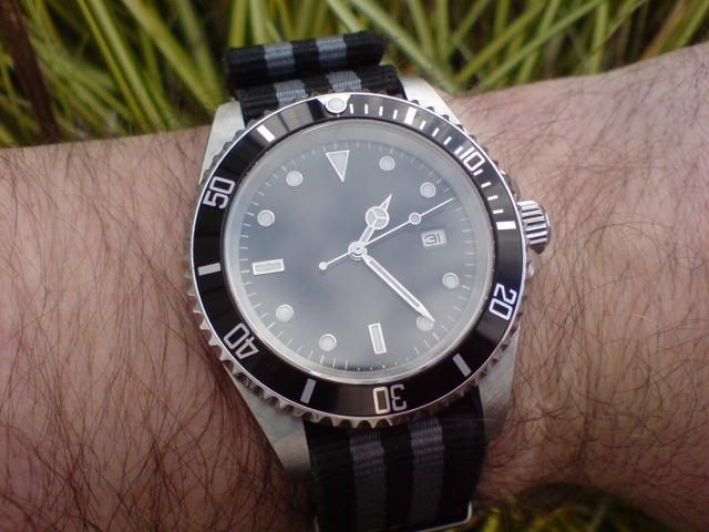
As I mentioned on this thread about the sterile (and excellent) UHR-222, whether a sterile dial watch works depends on the individual watch and the owner's expectations. I rapidly flipped a MKII Vantage, in part because I felt it's dial was too empty but for some reason this is not a problem on the even more sterile UHR.
David
Infinite Diversity in Infinite Combinations
I do like that UHR-222...the only problem I have, is that the watch is so Rolex-like, the brain expects to see Rolex in the top half of the dial. It's like the word dropped off the dial.
I'm sure I had that same feeling with the MKII Vantage but not so with the UHR.
It's a funny business this watch fancying.
David
Infinite Diversity in Infinite Combinations

I also have had and flipped the Speedbird 3 and the bit that bugs me is GREAT BRITAIN at the bottom of the dial. IMO it's far too big and does not have the right associations with watch making to justify its existence in such a prominent manner. Otherwise I love the watch, which is why I have had so many of them, but they just get the love they deserve.
This proves we've all got different taste...I like the GB!
I prefer sterile dials over dials with text, logo and what not.
Some of the more outlandish watch offerings with the the watch plastered with text and logo actually make me laugh.
Some of my favourite sterile watches:

I like a bit of wording on the dial - but not too much. I think i like the name of the watch but not necessarily the manufacturer?
Thinking about this more, the "Everest" black text on the PRS-25 is a very good way to include the name in a non-obtrusive fashion. I have noticed this on a few aircraft instruments too - I wonder if it originated from these.
It's a no from me. I like a word or two. Nothing at all makes it look too much like a home-made watch, or something bought from the market, or the original dial is missing. Yes I know fliegers and Panerai were traditionally unbranded, but they were devices made for war. I can't say I've ever had a problem with legibility because of two or three manufacturer's names or model types - they're there all the time, and my brain's pretty adept at filtering that out.
...but what do I know; I don't even like watches!
Generally no for me, as basic design rules suggest you need a mix of opposites to bring out the flavour, it just looks more sophisticated. Large and small, light and dark, warm and cool, brushed and shiny, foreground, mid ground, and background, they all help to emphasise each other. It's just how the brain works, and also applies to bread and butter, sweet and sour, bass and treble, percussion and melody. Sterile dials where everything is roughly the same scale and line weight can end up looking a bit plain, and a bit young and unsophisticated, as if designed for children. There are exceptions, but note that the UHR already mentioned does have 'automatic' written on it in small writing, which serves this function. Sub-dials can also do it, on otherwise sterile pilot's watches that have quite blocky graphics. It's about having a mix of scales basically, it just works.
And with watches, which also express a delight in miniaturisation, at often helps to have some fine details that are right at the limit of what you could possibly read or see, which is why I don't mind the often mocked 'superlative chronometer officially certified' in 1 mm high writing, you just need something there, it doesn't matter what.
And then there's the whole brand names voodoo too, which can make or break a watch, either with their graphic style or brand associations.
Last edited by Itsguy; 31st January 2013 at 12:03.
I prefer sterile dial without day/date, seconds hand, logo or writing cluttering up the dial.
That being said, in regards to some watches, where the writing is not very gaudy, you just dont notice the logo/writing after a while (which you hint at, though we reach different conclusions). At least that was the case with my GP GGYC. I was somewhat apprehensive, when I first saw the 'BMW-Oracle' writing, but its very discreet and one actually dont notice it at all after a short while. I would much rather have done without it, but accepted it in an otherwise fantastic watch.
How ever, I dont agree at all with your statement, that writing on the dial brings 'out the flavour' (what ever that means!?), nor do I find, that it looks sophisticated, emphasises anything, 'mixes scales' (what ever that means!) or that it 'works.'
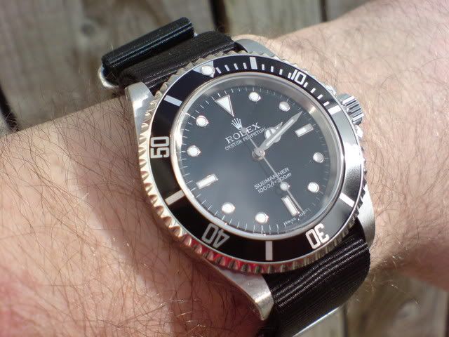
You mention writing on watch dials being 'sophisticated' and you go on to mention Rolex.
You find this sophiticated (pic below)?
I honestly want to know, as judging from your above post, people are different.
'Sophisticated' might actually be the word, that pops into your head when seeing this.
NB Lets not make this about brand loyalty, but purely about writing on dials.

Last edited by WatchScout; 31st January 2013 at 14:04.
Depends on the watch but a sterile sub just didn't work for me, it needs a little text.
Same with custom Seikos. a lot of the aftermarket dials just need an extra wee bit of text to make them right.

A point well made, but actually I was referring to something more like this:
For me, just the right amount of text to fill out a very restrained dial. As for what 'brings out the flavour' means, it's almost literal, in that smooth, moist butter tastes best when attached to dry, rough bread, sweet tastes good against sour and so on. From a graphic design point of view, larger elements are only large in relation to something smaller, and vica versa. Colours work the same way. There are exceptions I'm sure, but most good graphic design seems to work because of contrasts - between different fonts, between text and space, between scales and line weights. I'm no designer but this makes sense to me and some tiny text on a watch face always seems to add interest and sharpness. Brand names is another discussion for sure, and I'm not necessarily advocating going with the herd here, I just find poorly designed logos disappointing, they don't need to be famous. The right one can add something (IWC never seems to hurt, but even NIXON looks quite good), the wrong one can mess up an otherwise good dial.
Last edited by Itsguy; 31st January 2013 at 14:30.
 Posting Permissions