Reply With Quote
Gas escape valves that have 'gas escape valve' written on them.


Date wheels that don't match the dial. If micro-brands can get this right then why can't the big players?
Gas escape valves that have 'gas escape valve' written on them.
Huge useless crown guards
Winders on the left...it's just wrong....oh and watches worn on the right wrist...again just wrong...even if the winder is on the left.

Hate Cyclops
Hate Numerals
Hate Dive watches!

In which case, wearing a watch on your left (if left-handed) is equally just wrong, unless you like lots of wear and tear! Wearing it on the left, like all the normals do, is a good route to damage and feels odd. It does make it slightly harder to wind, although you should probably be taking it off to do that anyway.Originally Posted by Orange Peel

Last edited by andrew; 19th November 2014 at 12:00. Reason: left... not right. Doh
...but what do I know; I don't even like watches!

Gold bracelets and notched straps. Urk!
Ah, and a price that I can't afford.
Fake watches annoy me.
Having read this thread I now think I don't like half of my watches and the want list is looking a bit dubious too!
Numbers chopped on the dial (realized this when trying an AP ROO last week)
Mesh & NATO, just don't get them for day to day.
I'm very sorry if I posted a picture of a fake watch, it wasn't really my intention! However, the original model has more or less the same problem IMHO.
Hope this one is real.

Bracelets that don't come with a half link provided on purchase - my effeminate wrist needs the half desperately!
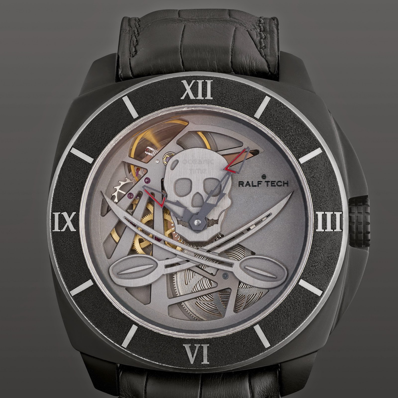
Skulls and pirates

Some of the owners.
Numerals, except on the bezel. Even worse if there are numerals on face and bezel and they are different fonts. I prefer a clean face.
Is it the California dial that mixes Roman and Arabic numerals? Yuk
I'm not too impressed by the scissors either.
I've only been into watches for a short time but have figured out a few personal deal breakers.
1: I don't mind whether a watch has a date or not, I can live with either, what I can't live with is watches with more than 1 number visible in the date window.
2: Date windows in place of a number n the dial. eg. at 6, when the date is the 5th the dial reads 1, 2, 3, 4, 5, 5, 7 etc.
There are a few more which I cant think of right now.
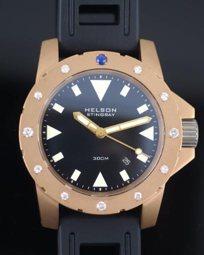
I dislike Cyclops, coloured flashy bezels, and diamond encrusted bezels.
For me its a Cyclops, Roman numerals and gold.
Dislike diamonds on a watch bezel, I personally think it doesn't look very classy.
Yes, no diamonds or gems
Dislike massive bezels

+1
There's a frequent poster over on the WUS Breitling sub-forum who constantly trots out his diamond bezel Chronomat (might not be a Chronomat), to the usual WUS sycophantic praise that makes us sensible TZUKers cringe - and it looks really feminine - really doesnt look good at all on a hairy mans arm. Dare point this out, no matter how politely, and you'll get a ban!
Anyway, diamonds on a mans watch just doesnt look good in my personal opinion.
That also covers TOWIE and Geordie Shore.
Mercedes hands
Gold
Seiko that you cant wind so you may not get enough power in it to last the night.
Another vote for Mercedes hands, I thought I was alone on that one until this thread.
Sub dials cutting into numbers.
Cyclops.
Huge cases(I'm quite versatile, but some cases I've seen!).
Bracelets that stick out at awkward angles from the case meaning even a sensible sized case wears massive.
Awkwardly positioned date windows(sometimes it just looks as though no effort has been made here).
Pepsi dials. Eugh.
- Busy dials
- Mesh straps
- Engraved rehaut
- Wire lugs
I don't like "open" hands, and I prefer not to have mineral crystals.
Also hate small crowns.
But most of all I hate scratches!
Chaps
I think large chunky gold watches just look trashy and makes the wearer look trashy.
Gold watches should be slim and discrete.
Mick
Dog pooh.
I hate dog pooh on a watch.
Last edited by lysanderxiii; 27th December 2014 at 22:53.
And here I'm thinking that was just me
Absolutely deteste NATO straps. Don't see the point. Think they're ugly, look cheap and spoil a perfectly good watch. What's wrong with metal or leather??
:-O
Lawl!
1/ Cyclops
2/ Cyclops
3/ Cyclops

Safer, more versatile and often more comfortable.
Also, for diving; leather is useless and many bracelets lack the right adjustments. The fixed length dive extension isn't actually functional a lot of the time unless it is just right for the thickness of the wetsuit you are wearing that day. Rubber or NATO's are the go.

Smudges on the glass. Drives me mad!
Partial numbers on dials ala' IWC Portuguese
Roman numerals (they belong on a Grandfather clock)
Unreadable dials and watches that you can't tell the time on (one handed watches or ones where you need the manual with you e.g. SevenFriday)
Cluttered dials with all sorts of writing to describe every feature of the watch ala Tudor self winding rotor (yet somehow I don't mind Perpetual blah blah on a Rolex)
Gems and blingy style dials/bracelets/cases
Watches with things stuck on for no apparent reason e.g. every Graham watch ever made
Rattly bracelets fitted to every sub £150 Seiko
Nato straps fitted to watches costing more than £50
Absolulty this!
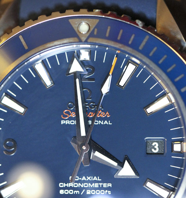
Everytime I see a beautiful Liquid Metal Omega PO in that stunning gloss blue I can't get past the matt black date wheel!
Even a gloss white wheel would have looked so much better than just using one across the entire range!
Ouch!
Last edited by MrSimba; 29th December 2014 at 21:22.
Disney characters on watches and similar cartoon ventures by the swatch group
Large (43mm+) watches
Expanding straps put on classic omegas
Rolex rattling bracelet on 14060m
 Posting Permissions