
 Reply With Quote
If only they had made a two-timezone watch based on that cockpit clock, now that would have been something!


Apologies if this article is already known about, but I found it interesting. Still don't like the watch though.
http://www.salonqp.com/updates/new_w...paign=DM102692

If only they had made a two-timezone watch based on that cockpit clock, now that would have been something!
Good call! Yes, they missed a trick there.

So it's a redialled Milgauss for pilots, retailing at £4150, that ties in with the Bloodhound land speed record car.
Quite cool really, I'd have one over a Bremont.
I presume the brushed bracelet will fit the milguass for those who dislike the pcl
At around a grand, yes - but it will be quite a lot cheaper to just brush the centre links of a Milgauss :).Originally Posted by Gav

(Which would then look odd, as the Milgauss's case is polished, and an all-brushed bracelet would then look like it just had the wrong bracelet on)
...but what do I know; I don't even like watches!
Just out of interest, did you think it was OK before, or is it only finding out about the relationship to the Bloodhound that now makes it OK? Serious question, it would be interesting to find out how much one's perception is modified not by what it is, but what it's related to, or refers to.
...but what do I know; I don't even like watches!
I'll readily admit to liking it a hell of a lot more now.
Sometimes it's good to know what drives design decisions. A bi-coloured bezel and a big pointy arrow hand just looks odd until someone explains it demarcates between night and day, and was designed to keep track of separate timezones for Pan-Am pilots in the 50s and 60s.
Then it's cool...
It's growing on me, redialled Milgauss or not.
Oddly enough I do like it, however it defeats the purpose of being a pilots watch since none of the numerals are lumed apart from the hands and the triangle at the 12.. Maybe they designed it for those pilots who only fly during the day...
There's a lot of shrieking going on the other Rolex forums. I guess people aren't that watch-mad if they didn't get the Bloodhound reference in the first place ;). I can easily see that some functions might need explaining from an aesthetic standpoint, but the "the fools just badly modded a load of old Explorer dials and used some crayons, I'm not buying that" is becoming "cool, just like the, what's it called, Bloodfest thing." I mean it's still using an old Explorer dial, right, with a mishmash of fonts and colour.
...but what do I know; I don't even like watches!
Really..?
Because that just seems like the usual agenda rather than 'just out of interest' ;)
Did I know Rolex made the gauges for the Bloodhound; nope. Do I have a Rolex watch; yes I do. Is my name on the tailfin of the Bloodhound? Yes it is.
Do I like the project or the watches any the less or consider myself any less of an enthusiast about both things because I didn't know they were linked? Nope.
Last edited by DB9yeti; 25th March 2016 at 11:59.
Great link, as that really does explain a lot about one of the most mystifying watches they've ever produced (and by mystifying I mean utterly dreadful). That Bloodhound dial with the sub-seconds actually does look pretty cool. But that's before they removed the sub seconds and tried to make it from left over bits of an explorer.
Love the button on the dashboard that says "Rolex Power". Wonder what it does...

Thanks for the post, personally I love the new Air King but the price is the killer so I won't be buying one. Really interesting article though.
Turns on the juice to the electrically powered speedo & chronograph? Doesn't mention 'mechanical' in this article:
http://www.bloodhoundssc.com/news/ro...truments-speed
______
Jim.
I think its an absolute bloody shame that rolex didn't stick more closely to the cockpit clock and stuck the silver numerals on.
lt will, however, amuse me to watch the phenomenon of crown-induced blindness kick in over the next few weeks and people reversing their initial objective first impressions.
It has, it seems, already begun...

Nope, it is still a dogs dinner;)
Too big, and the dial's a mess.
Paul

Very interesting thanks.
great, now i want a milgauss. the airking is fugly - and watch associations with cars/planes/secret agents
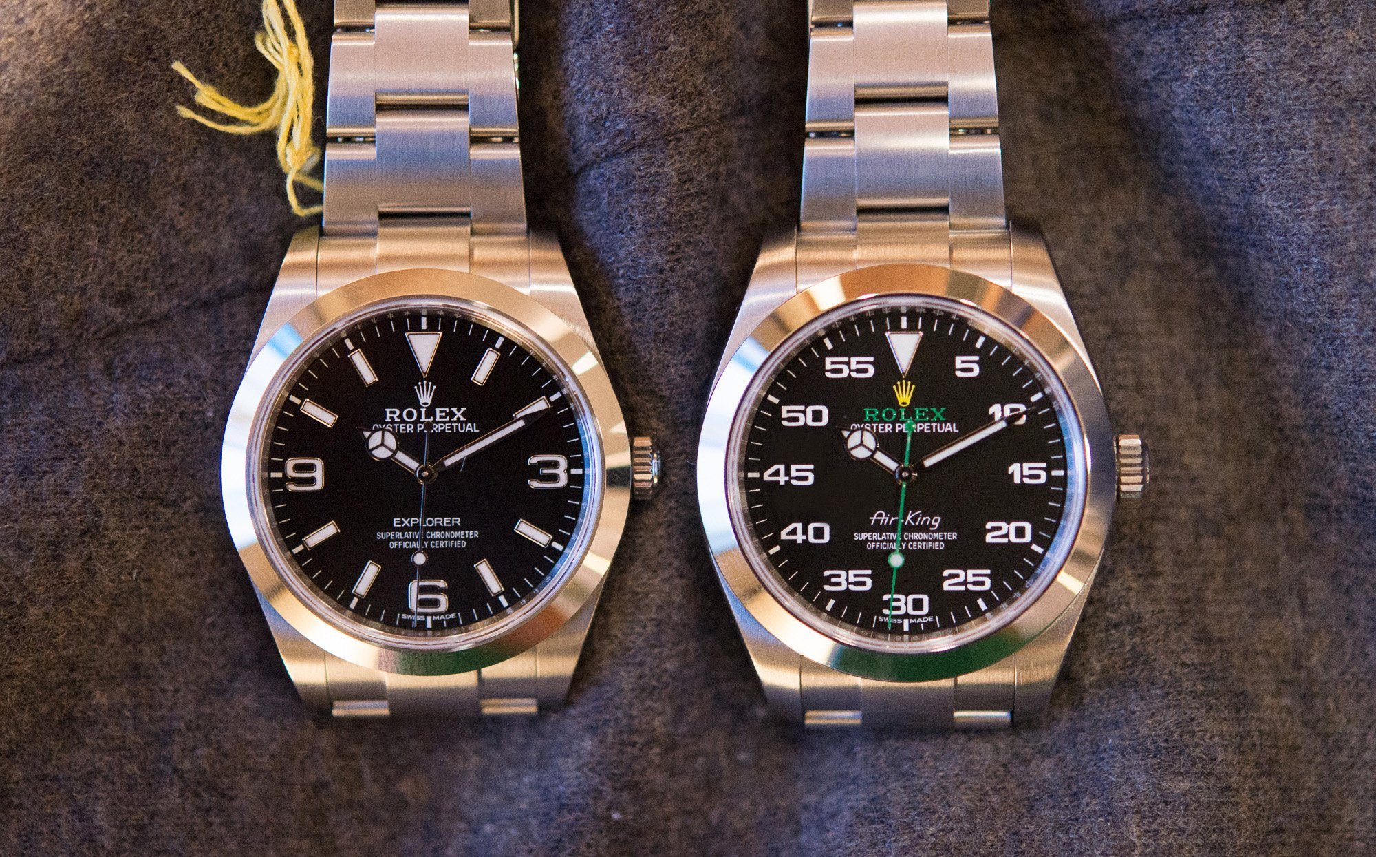
Eight things you need to know about the Air King:
1. It's ugly
2. It's a rebadged Milgauss
3. It'll sell which proves money and taste have no connection
4. It's ugly
5. It's got the 3/6/9 numbers on the dial from the now discontinued Explorer (that'll now have lume filled numerals)
6. It looks like a watch put together from the Rolex parts bin
7. Pilots won't buy them
8. It's ugly.
You missed:-
9. Itll probably sell well.
10. It will shortly acquire a crap nickname.
11. If it doesn't sell well, it'll be discontinued and become highly sought-after - largely by the collectors who currently hate it.
Since everything seems to need a Star Wars based nickname, I suggest THE PHANTOM MENACE
Based upon the use of green and a mixture of fonts I propose the nickname should be the Rolex Frog In A Blender.
(Has anyone seen a proper fanboy nicknaming thread yet?)
I think it would've been nice if they had only used minute markers, and baton hands.
Will it turn red when you wind the crown?
I would just call it "The Bitsa"
Someone on TRF started a thread proposing that The Sprite should be the adopted name, other suggestions included John Deere and Green Lantern.
You mean the usual agenda of calling out the dearth of original thought?
"What a crap looking watch."
"Yah but it looks like a noddy clock Rolex put in a fast car for marketing purposes."
"Hey, cool watch!"
You might be right.
- - - Updated - - -
How about the "piece of crap oh wait I saw one like it on social media, I've just put my name down*?
...but what do I know; I don't even like watches!
It's nothing but a tactical distraction to let the Daytona establish itself.
"Bite my shiny metal ass."
- Bender Bending Rodríguez
Thanks, I read this and some of the related articles. I thought it was disappointing TBH. As far as I can see the two cockpit 'instruments' are effectively backlit sponsorship logos. The speedo is a back up to the digital display in the cockpit, in the event of a 'systems failure', a scenario which would surely cause the immediate termination of a run. The 'clock' is I think primarily an electric chronograph (hence the power on button etc.). Fine as far as it goes but I'm pretty sure that Andy Green will not be pressing stop and go as he passes the markers. I'm as much of a sucker for marketing tie ins as anyone else but as far as I can see these 'instruments' have less connection to a real watch than this does:
PS Not anti-Rolex BTW, I really like some of them and the heritage.
Last edited by alfat33; 26th March 2016 at 11:39.
Sorry I've only just seen this!
I didn't dislike it before actually. Slightly odd looking at first glance; but it's a grower and I'm sure will be fabulous in the flesh.
I prefer it to all but the white dial Milgauss. If I was a pilot I would wear a GPS referenced watch of some sort though!
How about you?
Notwithstanding this explanation, it's still too big and the dial is too busy for my taste. I can never see the point of minute numerals on a dial, especially this prominent.
I guess it makes sense on a stopwatch, which is easentially what this is derived from. Personally I like the design.
This sums it up for me, much prefer the Milgauss or a vintage Air king
I'd imagine it will end up with a Bloodhound related nickname... how long will it be until there are a myriad of posts featuring: 'I need to get a Nato for the Bloody' or 'my Hound needs new shoes'
New collar for me hound
Whilst i agree with the comments about it being a mixed bag dial wise, i'd still have one, no problem. Looks like a mental Milgauss that could appeal to a younger, non-wis crowd perhaps ?
Personally
I love it
I can't wait to see one for real
Looks a mess to me. Makes you wonder how they manage the creative process.
I like the extra colour and I like the minute markers. I don't like how it looks like an excercise to use up the old Explorer dials with the WG hour markers though. Maybe when the supply of old hour markers has been used up they'll revert to all minute markers and this one will be a future collectors item.
Here's a picture from the Hodinkee comments section with a photoshopped dial, much nicer imo -
I don't like it, it looks hideous. I wonder if it would get this much attention if it didn't have Rolex on the dial. Really can't understand why it's got AirKing on the dial either. It just doesn't work for me. I'll pass
I don't mind it. It's something different.
And that, right there, is the watch they SHOULD have made. The simple exclusion of those old-explorer-hand-me-down numerals makes the world of difference and makes the watch more like the instrument its modelled on (for those who genuinely care...).
Now we just need baton hands ...
Yes. Though not a disaster, ideally the "Mercedes" setup would be replaced by baton hands. Good call.
Why I like the big numbers:
Rolex, as a top manufacturer of hyper exclusive timing instruments, has provided bespoke timing and speed references for the Bloodhound cockpit. You can't buy Rolex stop watches in the shops and BMW 3 series don't have Rolex made speedos.
The actual Bloodhound clock (it's a sub clock really) has the 3,6 and 9 numerals...
Chris Harris tweeted a pic of them switched off.
Carrying the design queues across to the Air King; the big numbers just complete the watch for me. Really like them.
Not sure I prefer it without the big numbers.
Last edited by TimeOut; 26th March 2016 at 22:31.
 Posting Permissions


