Reply With Quote
Not actually sure! Never measured it but know its pretty small. I have a regular speedmaster and thats pretty large on me but wear it anywayOriginally Posted by Incursore

Sent from my iPhone using Tapatalk


I broadly agree with abraxas. I wore mine on leather (briefly) and Natos for over a year before Eddie released the 20>16mm bracelet as an after market item. The thickness/weight of the Natos was fine, but being 20mm parallel and having a buckle wider than this never felt quite right. That said, an 18>15mm taper on the bracelet would be perfection for me, and 18mm Natos would work much better.
F.T.F.A.

Not actually sure! Never measured it but know its pretty small. I have a regular speedmaster and thats pretty large on me but wear it anyway
Sent from my iPhone using Tapatalk
Looks perfect in size actually
Now you're just showing off ;-)
What a beautiful watch.
Tempus non expectat virum et aestus.

It looks brilliant. It's a pity that Everest does not have the same (or very similar) proportions of hands. Then it could cost even £400.

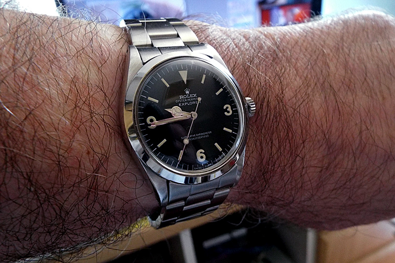
I can only say one thing Eddie, WOW. No wonder the Everest PRS-25 looks so good, all you have to do is look to its inspiration, ref 1016. Thanks Eddie for that awesome photo, and you are one lucky guy.
The 40mm version has more of these proportions, that combined with bigger wrist is what made me go for 40.
Although obviously very similar, the 36 and 40mm versions of this watch are quite different in the hand, and in character. The 40mm is a quite beefy and chunky knockabout watch that I wear for yomping around the woods for a few hours or when out cycling. The 36mm clearly has the vintage vibe and is worn in rotation as a daytime watch, usually I'll have my DC56, Voyager or even the 40mm Everest on overnight as they are all very legible in the small hours. The 36mm is permanently on the rivet bracelet now, but before that was available . . .

Mag, if you could only have one, which would it be?
36mm, I have a CWC RN quartz for the ruffty tuffty stuff.
^Thanks. I think I prefer the 36mm too.
I agree, the proportion of the hands was a major reason I went for the Expedition instead. Lets hope that the hinted-at Jubilee edition will have a more balanced hand set.
Tempus non expectat virum et aestus.
You are confusing 'balanced' with 'rolex'. They are balanced, they are just not rolex, and they will never be.
Interesting thought but I don't believe I am basing my view on Rolex. I'd never own a 1016 yet I still think the PRS-25 hands aren't balanced. I think:
~ Minute hand: needs to be shorter and should just touch the minute markers with its tip. I feel it should be slightly thinner, as it's disproportionately thick compared to the stem of the hour hand.
~ Hour hand: I think the hour hand should be fractionally longer, and that its stem should be thicker as it currently looks fragile compared to the other elements.
I fully accept that these are personal and subjective views; but they are not based on any love of Rolex, which I dont have.
Tempus non expectat virum et aestus.
You are fully entitled to your opinion - the great thing is that as a member of the forum your voice will be heard - and perhaps acted upon in future projects,
- - - Updated - - -
''Jubilee edition''?
"Once is happenstance. Twice is coincidence. The third time it's enemy action."
'Populism, the last refuge of a Tory scoundrel'.
Silver Jubilee Everest
https://forum.tz-uk.com/showthread.p...ubilee-Everest
Many thanks, hadn't seen that.
"Once is happenstance. Twice is coincidence. The third time it's enemy action."
'Populism, the last refuge of a Tory scoundrel'.
If you wear it on the bracelet at all Ian the Helitape is excellent for protecting the clasp. I have piece on mine. the exact width of the brushed section between polished outer parts. It's quite a little magnet for swirlies and scratches.
The biggest problem I see with the bracelet is the first link: it has the same width as the end link and should be a little narrower. Basically, I would remove that first link. The tapering would help with the case-bracelet proportions. The way the rivets stick out is not helping either.
Every other riveted bracelet on the market got this right, but this one looks like it was designed to fit a 22mm lug watch.
Mine arrived today, it's now sized up and perfect on the wrist, minimal rotor noise for a miyota so that's a bonus
Had the dispatch confirmation for an Everest and Explorer. Much sooner than expected.
I've just had money returned to my account, but no cancelation email so I guess I'm still on..?
Tiyr bank has just removed the reserve on the funds, I'm sure it will go through fine when I get to it.
Eddie
Whole chunks of my life come under the heading "it seemed like a good idea at the time".
lord knows what's happening to my watch which was shipped yesterday. It appears to be in limbo in Castle Donington.
This message appeared last night, went away and reappeared this afternoon.
"Held in Warehouse
UPS is holding the cargo at a secure facility, pending instructions and agreement. "
Last edited by fishbio2; 22nd September 2020 at 20:00.
Is that a ransom note?
Sent from my iPhone using Tapatalk
I agree with fm.tz on hands design/balance in the proportion to dial elements.
I own three of Eddie's marvels and missed out this time as website couldn't load for some 6-7 minutes and then all Everests were gone.
I am new here and hope that my opinion on design and feel on the Everest is ok, as I love the present iteration (great logo upgrade!), but as I see here, which positively amazes me, people's opinions are regarded as the viable input on future developments.
In that light I would leave here few more points that, in my mind (and heart), could be a positive change towards even greater feel in owning the Everest.
~ Embossed "Everest" to become printed as on white dial version (maybe even "automatic" or 100m ~ 330ft below it?).
~ Crown to be signed by Smiths crown from the logo on the dial to keep the branding consistent.
~ Back cover of the watch to keep the branding consistency and include the logo from the dial or the bracelet clasp.
Two other minor points:
~ I am ok with the bracelet design as it is consistent with the vintage feel, but maybe no rivets to give the watch overall look even more clean/simple design, as the vintage bracelets were nice and thin, simple and light, which would work in this case.
~ To maybe have different hands finish that will be more tooly, more visible (I know it is a departure from the 1016, but Eddie improves his designs to the originals in fine details anyways).
Hope you all go easy on me : )
Alex
Last edited by AlexGate; 23rd September 2020 at 00:53.
I totally agree with the above points. I do not own any of the Time Factors watches yet, nor have I ever had to do with any Rolex watches (I'm a fairly fresh collector, still learning the ropes). When I first saw the previous version of Everest, I immediately fell in love with it, since it was very balanced in many aspects. But since the newest version pictures appeared, I couldn't help but think that there's something strangely odd with it. While I really loved the new (classic) logo adjustment, I certainly felt, that the new hands are a bit odd. I've consulted that with a friend, who is also kinda new in this hobby, and without me suggesting anything - he pointed out the same things as you did. Especially with the minute hand, it is a bit too long and a bit too wide now, imho.
I'm really diggin mine Everest (first TF watch I've owned), the new logo is superb and was a excellent decision to update it from the standard Smiths text logo.
The handset look fine to me and to be honest I hadn't even noticed the "issue" that is talked about on the forum so that to be looks to be personal preference (isn't everything), whilst we are on the subject of possible amendments to this classic design then I have a couple, bare in mind this is just my personal opinion so don't shout at me....
1) The current EVEREST text - same font, same letter height, just reprinted in white on the dial giving the watch face slightly more symmetry.
2) The rivet bracelet is excellent and captures that vintage aesthetic, the first link after the SEL could do with being a mm or so slimmer just to enhance the taper visually.
3) Maybe, just maybe, change the movement to a bi-directional wind to remove rotor noise that is typical with the Miyota series.
Just my input and personal opinions and of course would be subject to cost etc.
Last edited by Planet Ocean; 23rd September 2020 at 07:55.
There's never been an "issue" with the hands, of course, it's all just personal preference. Re point 2) above, if the first link was narrowed down the faux plates on the links wouldn't align with the machined lines on the end links and would look stepped down, not visually very good IMHO. That said, I've always believed the lug width of this watch should have been 19mm, it's not meant to be a precise copy of a 1016 after all. At the end of the day, whatever dimensions Eddie made the watch to, there'd always be someone wanting something changed.
 Posting Permissions