Reply With Quote
Looking at the underside of a rolex sub (l know - not quite the same league) is, in many ways, similar - simple but very well-designed. Quality and complicated do not always necessarily have to go together.


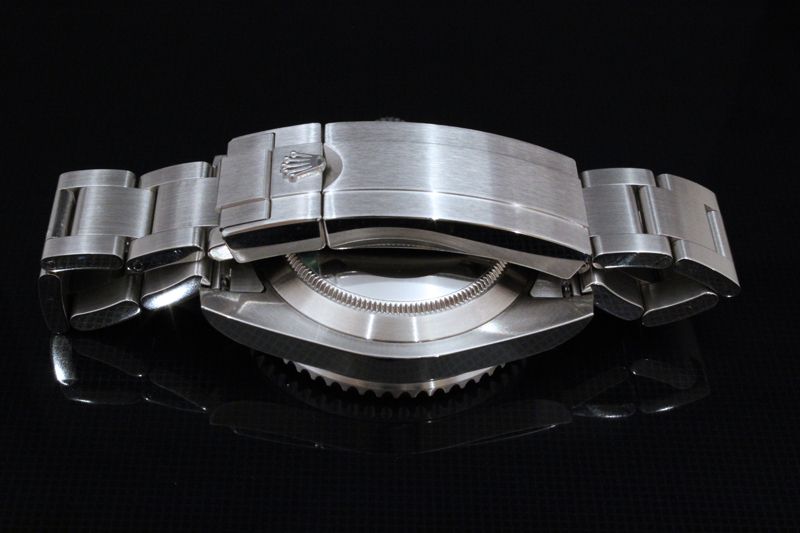
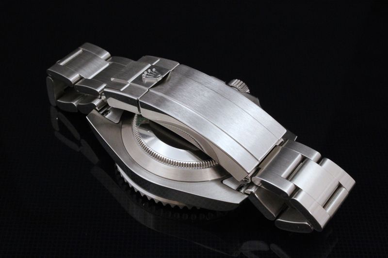
Not Patek knocking. Admire them a lot. Just surprised at the plain contour of the underside of the Nautilus case beyond the bezel.
And the plainness/simplicity of design of the edges and the sides of the case beyond the 'hinge'. (What would be lugs on a 'normal' watch.)
Quite a handsome face, though.

Looking at the underside of a rolex sub (l know - not quite the same league) is, in many ways, similar - simple but very well-designed. Quality and complicated do not always necessarily have to go together.
Well, both the Patek and the Rolex are simple, anyway. As for "well-designed", is it perhaps more of a case of 'undesigned'? They almost look as if they just ended up like that.Originally Posted by Umbongo

Last edited by Tinker; 9th May 2014 at 01:58.
That's pretty much the key to good design.
Agree entirely.
I can't see what the OP is getting at here, all looks good to me?
I think he's saying that it's just flat - no beveled edges or chamfers. This is true (I have one) and I must admit that the finishing on the 'unseen' edges is either understated or unrefined, depending on your point of view.
But probably very comfortable on the wrist?
Its also very easy to refinish those surfaces during service. A lot of engravings etc makes it more difficult to get back to "like new" status.
I like the fact they don't feel the need to adorn it with unnecessary lines of text, logos, or any other superfluous elements. Seeing the movement says everything that needs to be said.
Keeping it simple to highlight the more important stuff inside.
Exactly.
My experience of Rolex sports models is that the flat sides and particularly the 90 degree edges almost attract damage (whilst rounded contours tend to deflect it).
In the case of the Patek (for which, let me repeat, I have the greatest horological respect), the flat sides and sharp edges are almost identical to a Rolex.
I find this surprising.

The back works better than the front for me...
M.
Breitling Cosmonaute 809 - What's not to like?
Exactly. Ever notice how the companies whose watches have the strongest residuals and age the best also tend have the least-adorned backs? For practical and aesthetic reasons, I much prefer the less-is-more approach than the NASCAR-esque listing of every marketing gimmick that some do.

Your first point seems right about the backs. A few curves on the sides might help deflect damage, though.
As for the NASCAR nonsense, however, you're dead right ...

And that's downright restrained compared to some of their other stuff...
image source: omegawatches.com
Well you can't see much of interest, so you might as well have a read!
Seems odd that the Nautilus is so plain on the front when the back is so nice!
M.
Breitling Cosmonaute 809 - What's not to like?

I see absolutely no point in having a fully engraved caseback, or display back for that matter, I never take a look at the back of a watch. And, I don't like the display backs because they make the watch stick to my wrist, I find it uncomfortable.
Hard to see from the pic but isn't the back of the watch case just inline with the bracelet? wouldn't rounded edges look out of place with the flat bracelet links?
On a simple watch it's easy to say why wasn't such and such done, the test should be, does the watch design work, or does an element look wrong/out of place, as said from the pic it likes fine to me. The rest is just subjective.
I wouldn't say curved surfaces deflect damage to any great extent on watches - these are watches, not armoured vehicles - you just end up with a damaged curved surface rather than a damaged flat surface.
You're probably right. Is it the case ... sorry, this phrase just keeps cropping up ... is it the case that a dink on a curve doesn't look so bad as a nick on a 90 degree edge?
Anyway, looking at the right hand bottom 'lug', as seen in the image below, is there already some damage to the Patek?

 Posting Permissions