
 Reply With Quote
Sold! Im in. Thats gorgeous! Any timeframe?


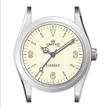
This is the dial I'm favouring.
Same "white" as the Air ministry
Lumed numbers and indices
Lume filled blued hands
Rivet bracelet 20mm tapering to 16mm
Standard clasp
Eddie
Whole chunks of my life come under the heading "it seemed like a good idea at the time".

Sold! Im in. Thats gorgeous! Any timeframe?
Moobs logo looks great on there.
Good luck everybody. Have a good one.

Looks fantastic.
Not so sure on the lume colour though...Maybe a faux vintage lume like the PRS-82 perhaps?
Sent from my iPhone using Tapatalk

I agree, a darker yellow lume like on the PRS-82 would look better imo.Originally Posted by senraw

Eddie, have you considered using a closed minute track like on the original white dialed explorer?
Also, the hour hand should be slightly bigger (1mm if memory serves me right).

I would also support the darker lume!
I was planning on using the super-bright X1-C3 lume on this and that isn't available in vintage.
Eddie
Whole chunks of my life come under the heading "it seemed like a good idea at the time".
Love the logo too!
Also another vote for slightly darker lume - its not a big deal though.
Looking forward to this as much as the black dial.
Any chance of this colour dial in 40mm Everest?
tbh not a fan of the faux vintage looking lume myself. The super bright offers nice extra utility.
Its another yes from me!
May would be good, the wife could get me it for my birthday.
Cheers,
Adam.
Sent from my iPhone using Tapatalk
Thank you Eddie, this is close to perfection! Especially the logo without the second line of text. Only thing i would change is the size and or the style of the hands. Is mercedes style a must? Would like to see hands as well balanced as on the 29A.
X1-C3 lume is just great!
I'm not sure that would be a popular move among us 1016 style fans!
I will be buying this watch! Perfect Eddy as posted. When will it be available for purchase?
As I've said elsewhere, I'll show my ar$e in Doggart's window if this happens . . .
F.T.F.A.
One of the predecessors of the 1016, the 6350, came with a stunning honeycomb dial and normal hands (as an option):
I would have no problem with hands like that.
I'm trying to imagine what it will actually look like with that like given the colour differences (of the dial at least) of this render and the air ministry. As it stands though, I'm sold. 20 to 16 with a regular clasp sounds perfect.
Would the bracelet from the black dial be interchangeable? I know some love adjustment on the go (although I've not found a need)
Sold on the non-vintage lume, dial (though honeycomb would be awesome), size, bracelet.
Unsure on the blues hands, I think that I prefer just brushed/polished. Would like to see non Mercedes mocked up.
This is the most exciting of the current PRS-25 models for me and the one Im holding onto my cash for!
Sent from my iPhone using TZ-UK mobile app

Yep. Still liking that. Super-bright lume sounds cool as well.
Dave E
Skating away on the thin ice of a new day
For inspiration, another white dialed Explorer. The 6298:

Lumed blue hands is a winner for me. Nice.
Id kill for those pencil hands !!
No waffle though.
Like this special edition Tudor

Perfect, those options are just right, imho, including the super-bright lume. As an Air Ministry owner, I like the idea of that dial colour again coupled to blued hands, and the 4mm bracelet taper just tops it off. I will definitely be ordering one.
Dave
This is getting my watch boner stirring in the depths of my horological undercrackers, and I don't even like white dials
Good luck everybody. Have a good one.
Buy this and then have the 36 black and white, and then use the 20-16mm riveted bracelet on both black and white, wearing each for a month or so at a time. Surely the case will be the same and hence the bracelets will interchange? This is how my thinking is going. Perhaps the next bracelet will become available stand-alone too, which would save the swapping.
Im reducing to two watches. I shall I think reluctantly soon sell my new Everest 40mm to fund this white. I see the pair of 36s as a possible lovely 2-only long term solution. This small size is a really enjoyable surprise. When I fall off the perch my two sons can have a 36 each!
Sorry - just musing aloud ...
This answers my question about the future of Time Factors lume.
Last edited by James_; 23rd December 2018 at 00:29.
Dear Eddie,
I'm interested in the Everest 36mm with black dial, but I really would prefer for it the new planned rivet bracelet 20mm tapering to 16mm,with simple "old style" clasp. Will this bracelet be available for sale separately (please say yes ... !) ? Any design scheme or picture for it ?
Thanks in advance,
Engi
Did you (would you) consider a pure white dial with maybe the Everest legend in red?
And maybe straight hands???
Probably not but thought I'd ask anyway
Yes, I would like to see the hour hand return to 8mm from the 7mm in the black version.
I'd also like to see the lollipop move back a bit on the second hand, as well as its width be constant with some sort of counterbalance. In the black version, it's the one aspect of the hand set that has a slightly lower quality look than the rest.
I think a better and more correct fix would be to move the minute and hour markers 1mm to the outside of the dial. If you look at a 1016 dial you'll notice that the minute markers go all the way to the edge of the dial without any space left. On the 36mm Everest that is not the case; there's still about 1mm blank space left between the minute markers and the edge of the dial. The added benefit of moving the minute and hour markers 1mm to the outside would be that it makes the watch look slightly larger.
To be fair, of all the homages that have been produced over the years only the Japanese Incipio got the dial 100% right. Unfortunately the Incipio is rarer than hen's teeth, the Everest is the next best thing imo (and a lot cheaper).
I think the dial, bracelet and clasp are spot on. I'd like to see 1mm on the hour hand and the second hand disc moved more towards the centre, and slightly smaller.
If you are doing a "version 2" of the black dial after the first run is sold out, then the proposed white dial logo design is what I would use, plus Everest in either the same light colour as the logo, or in red. And with the proposed white dial bracelet and clasp.
Seeing as everyone is tossing a log on the fire, I would say...
Superlume, yes
Pencil hands - I would personally like to see these
Interesting to note on the textured dial Rolex pictured above, the dot on the lollipop seconds hand seems to extend beyond the hour markers (but this could be the angle of the picture)
Maybe moving the markers out to the edge of dial is a good idea.
Re print colour for logo and text, not sure about that - would have to see mockups. I think there's alot to be said for keeping it simple. Having an off cream for the everest might be nice and subtle, just as the black face has a dark grey.
Last edited by seikopath; 23rd December 2018 at 10:54.
Good luck everybody. Have a good one.
Are you not tempted to try it for a week or so just to see Dave?
I am going to size mine next week and try it for a while
No.
It was never about the bracelet for me
I can see all the advantages of that clasp for a nice chunky divers watch
For me fabric straps are just so much more practical.
I really really value having a nice light, smaller watch head that is very very legible. The everest just does that for me so completely. I've even retired my g10 to the watch box.
I would be interested in trying the dedicated bracelet with 16mm taper and small clasp, but only, I suspect, for academic reasons.
Good luck everybody. Have a good one.
An early contender for post of the holiday season.
J
Stick with the blued hands, Eddie, please. Lack of contrast between hands and dial is a killer for legibility, particularly for those of at a certain age where close vision is going downhill...
I'm also of the opinion that sticking with the Mercedes hands is the right plan. I like those pencil hands, but I think the Mercedes are the right choice for this.
Dave E
Skating away on the thin ice of a new day
The more i look at the dial the more i wonder if the black edging of the numbers and indices is necessary. With this great lume and the accurate printing maybe its possible to forgo the edging.
Yes, blued hands, please. I think these will be very important to give good contrast with the dial and provide decent legibility.
The pure luminova hour markings on the black 36mm are already quite small so, on the white, the border should be in addition to them, rather than using up any of the current lume. If this makes them look a little larger than those in the black then, imo, that would be no bad thing.
This ^
Sent from my iPhone using TZ-UK mobile app
Shouldnt the lume plots have a blue outline?
Sent from my iPhone using TZ-UK mobile app
Eddie's rendering looks perfect imho , Mercedes hands are one of the reasons
I like my 40mm version and one of the attractions of the Explorer , just got convince
Mrs T I need another watch!
I think the lume colour and that of the dial are too close to forego the edging, without it will just blend and be a bit wishy washy.
Another vote for the X1-C3 here
Sent from my iPad using Tapatalk
I love gold coloured hands etc with white dials
Id like to cast a vote for non-Mercedes hands. Its whats been keeping me from buying so far.
Sent from my iPhone using Tapatalk
Me too.
I like the Mercedes hands.
Blued pencil or syringe hands over a creamy waffle texture.....
It would make a nice point of separation from the black dialled models.
Sent from my iPhone using TZ-UK mobile app
Agreed
Also I think that blued Mercedes hands would look odd
Sent from my iPhone using Tapatalk
 Posting Permissions

