


 Reply With Quote
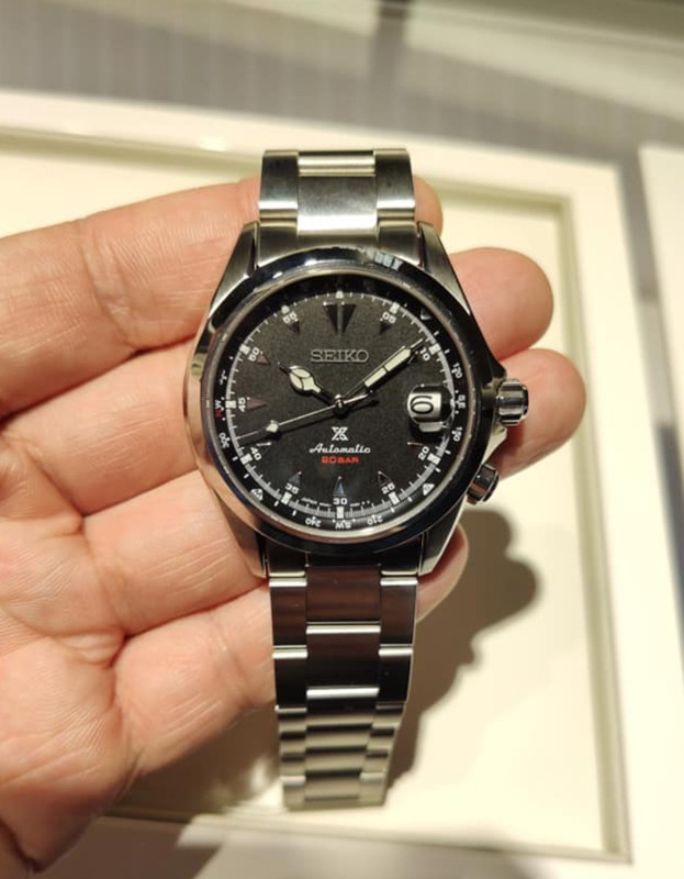
I liked the idea of the black version but looking at the pics the dial looks to be a kind of cheap looking, dull matte finish.
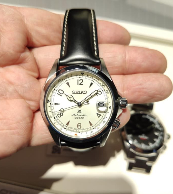
Of the three the white looks best - in pics at least.
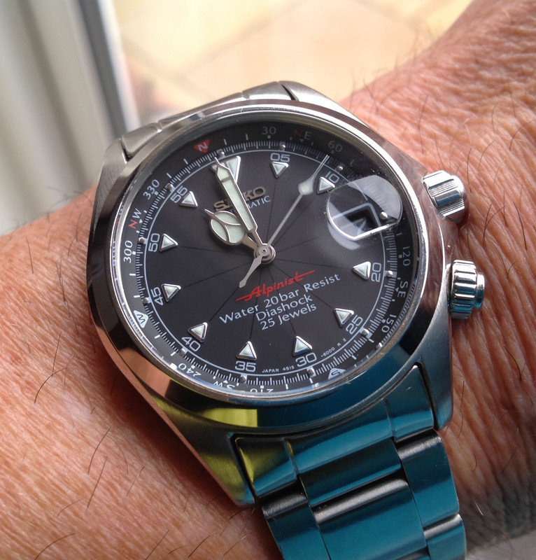
Looking at the green side by side with the Sarb017, there are things I like about both. I was originally against it having the X on the dial. But Id forgotten the 017 (which I used to own) had the DiaShock 23 Jewels text. I think the new model has better, less busy text. Im not a fan of any watch stating the amount of jewels on a dial - think it looks cheap. Seiko do that with the J models of the SKX and Seiko 5s, which makes IMO the cleaner looking K models better. I dont mind the cyclops (provided it turns out to have good magnification rather than being pointless decor), but I think the negative date of the 017 is better than the white wheel with black text on the new model. The real difference appears to be the the green; the Sarb has that beautiful sunburst whereas the new model looks a tad flat. Might just be the picture.
Im glad they having beefed up the case size as well. The Sarb Alpinist was a great size with beautifully curved lugs; it sat on the wrist so well. Would have preferred a steel case back with the Alpinist logo engraved over a display back.
Some changes seem to be for the better, some not so much. To the average Joe who couldnt give a monkeys about some obscure Seiko watch they would look identical.


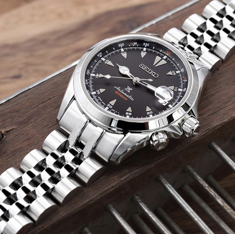


 ). Hilliers in the UK have the normal three in stock at present if anyone wants to buy any of those. £650 each less 10% discount.