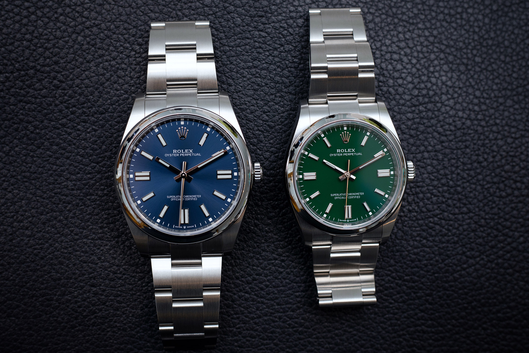
More pictures are emerging showing how the Oyster Perpetual 36 / 41s colours appear in real life, and they are starting to look very appealing. Less bright than the candy coloured promotional picture, the blue and green could be real winners. The blue has a classic sunburst, while the green appears to have a lovely deep and rich, autumnal / festive (or if you prefer âcolour of moneyâ) feeling. As an owner of a green dialled GS, itâs a colour that really hits the spot as the nights get longer.
I think they may have tweaked the colours in the promotional picture of all six so they all look similarly bright, so Iâll be interested to see how these look in real life. The blue OP39 was always a lovely watch blighted by questionable contrasting lume, so itâs good theyâve sorted that out, even if they have unfortunately inflated the case size. The 36 though, might just be perfect.


 Reply With Quote
Originally Posted by unkel